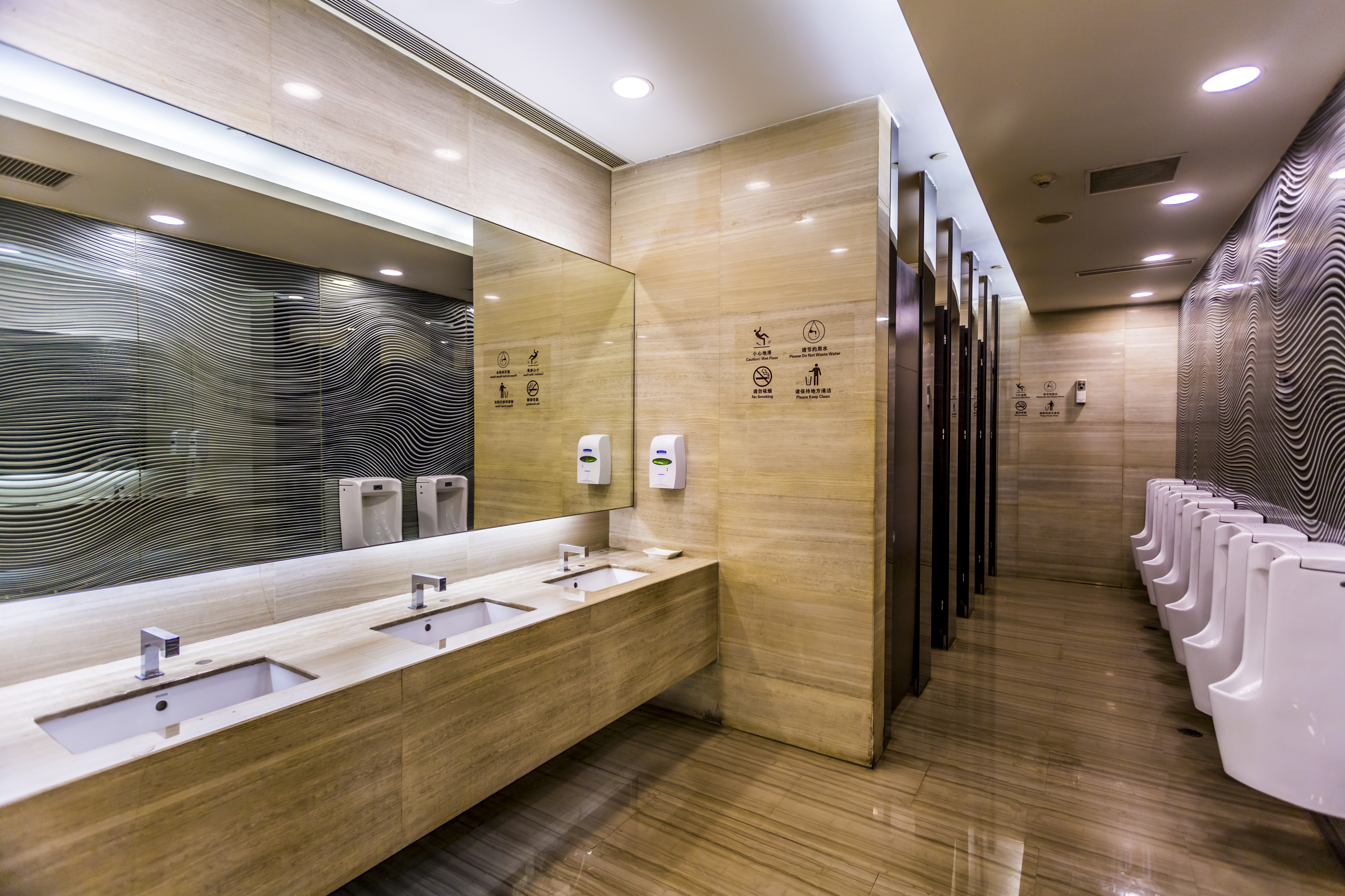
In this study, we have an interesting urinal that is not comfortable to use, an inexplicable paper towel dispenser, a faucet that is difficult to use, and an unsanitary soap dispenser. At the end of the article, there is a small example from a coffee shop, restaurant restroom.
Expert analysis, secondary research, observation, situational interviews and more...
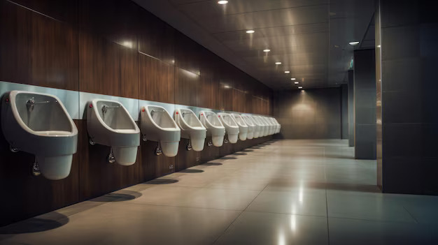
The design of the urinal immediately caught my attention as it was a design I had never seen before. However, contrary to the interest and curiosity it inspired in me, its use was not comfortable.
After this interesting and unpleasant experience, I took a closer look at the restroom and wondered if there was anything else around. It was recently cleaned so I didn't want to spend some time inside.
Urinal
During the daily purification ritual, the excessively wide design of the urinal prevents the comfortable performance of the ritual, in other words, comfortable urination. I struggled to keep my hands and arms from touching the urine during the ritual. Till date, I have never experienced such an encounter at any urinal. The plainness of the design adds an aesthetic element that diminishes the comfort of a significant ceremony.

When I researched the urinals on Jaguar's official website, their widths (in mm) were as follows: Length: 340mm, Width: 325mm, Height: 650mm, and only 1 model.
The width of the urinal discussed in this study is 356 mm. In fact, it is the widest urinal of the dozens of models available on the Internet. With this information, I am even more confident that I have correctly identified the focal point.
Urinal and separator
In Parryware's own website promotional images, there is no divider between the urinals. In fact, when the design is implemented, there is a separator. Also, the separator design is not attributed to the person who designed the product.
In many foreign countries we often see examples of no separators. However, in many place, I rarely see such examples.
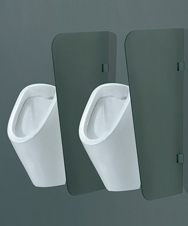
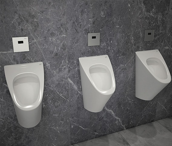
If the designer knows that the product will be implemented differently due to technical and cultural barriers, they will act accordingly.
In fact, in our application, the UX designer or UI designer, after receiving the outputs from the UX researcher, can conduct their own small-scale research, try to understand their target audience and examine how users interact with existing competitor products. In this case, users' urine experience and usage habits. With more information about user experiences and usage patterns, they can create different designs.
Faucet
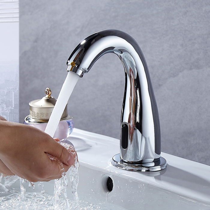
When I reach for the faucet to wash my hands, doesn't come water. I experience this every time (90%), to avoid this, I first bring my hands to the sensor in any sink, to start the water flow, and then I start washing my hands. This way, it is more reliable and faster.
Papel towel dispenser
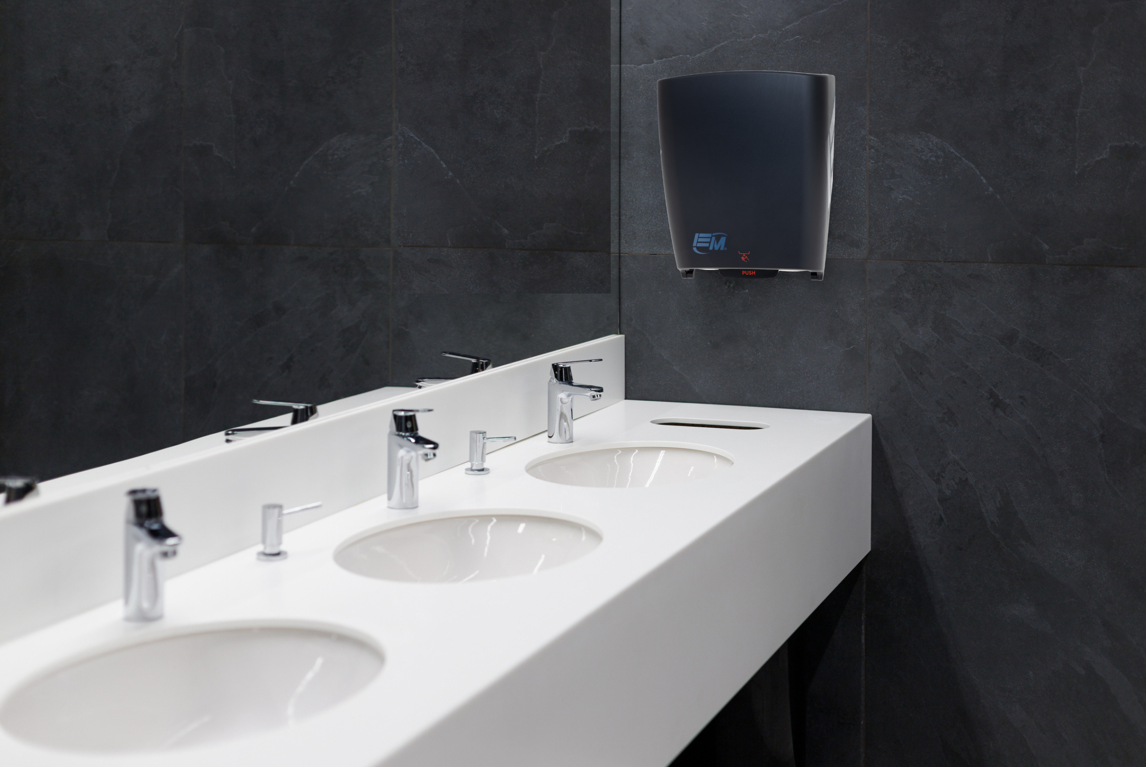
- Before picking up the paper, the light is already off. After pointing your hand at the sensor and picking up the paper, the light will appear and disappear for half a second.
- English instructions and other regional language instructions are different. In English, it says to put our hand under the part of the machine that feeds the paper, while in the other language, it says to put our hand under the circular red light on the right.
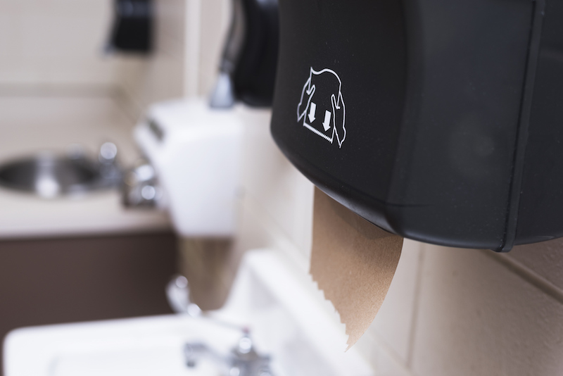
These machines often have warnings such as 'pull sheet left' or 'pull sheet right'. In this case, there is no such sign (perhaps it is not noticed), and I do not understand. Way to drag, so I had to guess and force it.
Additionally, I have noticed that there is always a bend in these machines in other toilets, just like in the picture above and on the papers. If the side the engine instructs you to pull is the opposite, that's another issue, of course.
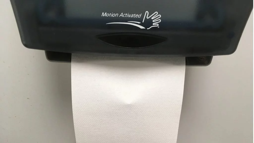
The brand suggests swiping from left to right. On the brand, like the photo on the top, it says 'to the side', but it doesn't specify which side, so it doesn't matter. According to the picture, we have to drag from left to right and upwards.
In the details you will read in the next section below, I noticed that all 8 people pulled the paper with their right hand. Regardless of where the machine was positioned (I'm assuming none of them were left-handed), they pulled the paper in the direction of their dominant hand.
Another behavior that caught my attention was that people would effortlessly pick up the paper if it occupied the nearest sink. If the page is empty they go to the front of the machine to pick it up. I believe many restrooms now have paper towel dispensers in one place near the door to avoid this kind of congestion.
Observation and contextual interview
To examine the behavior of using the faucet and paper towel dispenser, I had 5 people pretend they were fixing their hair or fixing their appearance in front of the sink. I cannot say whether the number is small or large, but I can say that this is the amount of resources I can devote to research.
Faucet
- 3 people, like me, initially thought the water wasn’t running.
- 2 people washed their hands as if everything was normal.
Pretending not to understand how the water was running successfully, I said to the 2 people who were washing their hands, 'Excuse me, this pipe is broken, how does it work?'
They said
- “The sensor is like this, just hold your hand under it, and the water flows automatically.”
Soap
To wash dirty hands, you need soap, but if you squeeze the soap, your hands are already dirty. You know the person before you touched that area after leaving the restroom. You use a special and fancy design, but even if we wash our hands, we have to touch the dirty part. After that, we wash the touched area for a long time.
The issue here is a long-standing and well-known problem, of course. Sensor-activated soaps started as a post-pandemic solution, but as we see, the old practice continues.
Even if the onboarding of our product is smooth, the initial impression is good, and the design is fancy, suddenly asking for the user's personal information seems like a pointless situation.
After few days later
A few days later I started this research and went back to the same mall. This time, not in the coffee shop and restaurant area, but in the regular upstairs restroom. As I entered, I was met with a sight that directly responded to my comment about the lack of urinals without dividers. There was a different design, but I can say that this design separator does not serve the same purpose.
Better understanding of target audience
I noticed something in the toilet of another coffee shop in Chennai. The men have pushed the toilet door away from the door instead of using the door handle, and the paint on the door is now worn off.
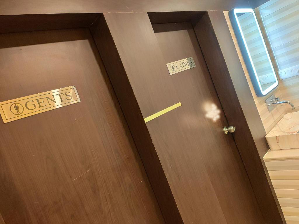
When designing a product, understanding our target audience – their behaviors, skills and thoughts – is critical.
The door is very heavy, and opening it with your finger through the handle is difficult and uncomfortable. It won't open without holding the handle with your palm, but that's not hygienic either.
In this situation, the designed product will not be used as intended. These experiences can have a significant financial and emotional impact on you or your business.
Concluding
There can be many initiatives to improve the restroom experience. I wanted to do some brainstorming, focusing on urinals and this particular example that popped up immediately. Although I didn't do it, benchmarking by visiting different restrooms is an option.
The subject, basically, is very comprehensive, very real and significant.

