Introduction
Knowing that the the Heuristic Evaluation can have a significant role in improving the usability of a product, I decided to use Nielsen Norman methodology to study and analyze the usability of Product app.The Scope
Business Strategy
User Environments

Heuristic Evaluation; Definition & Criteria
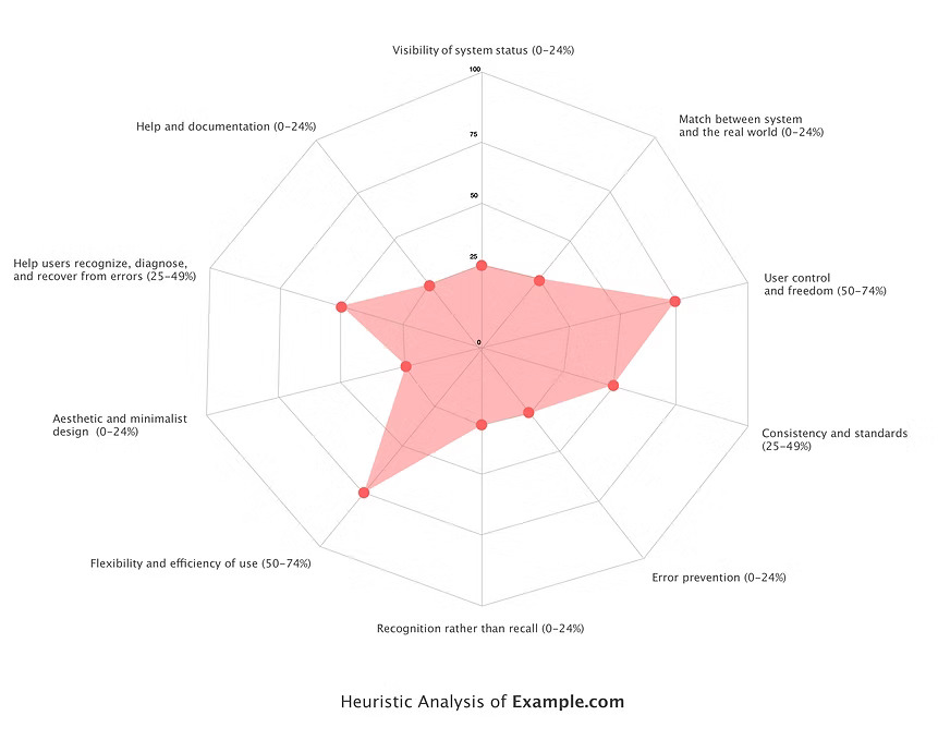
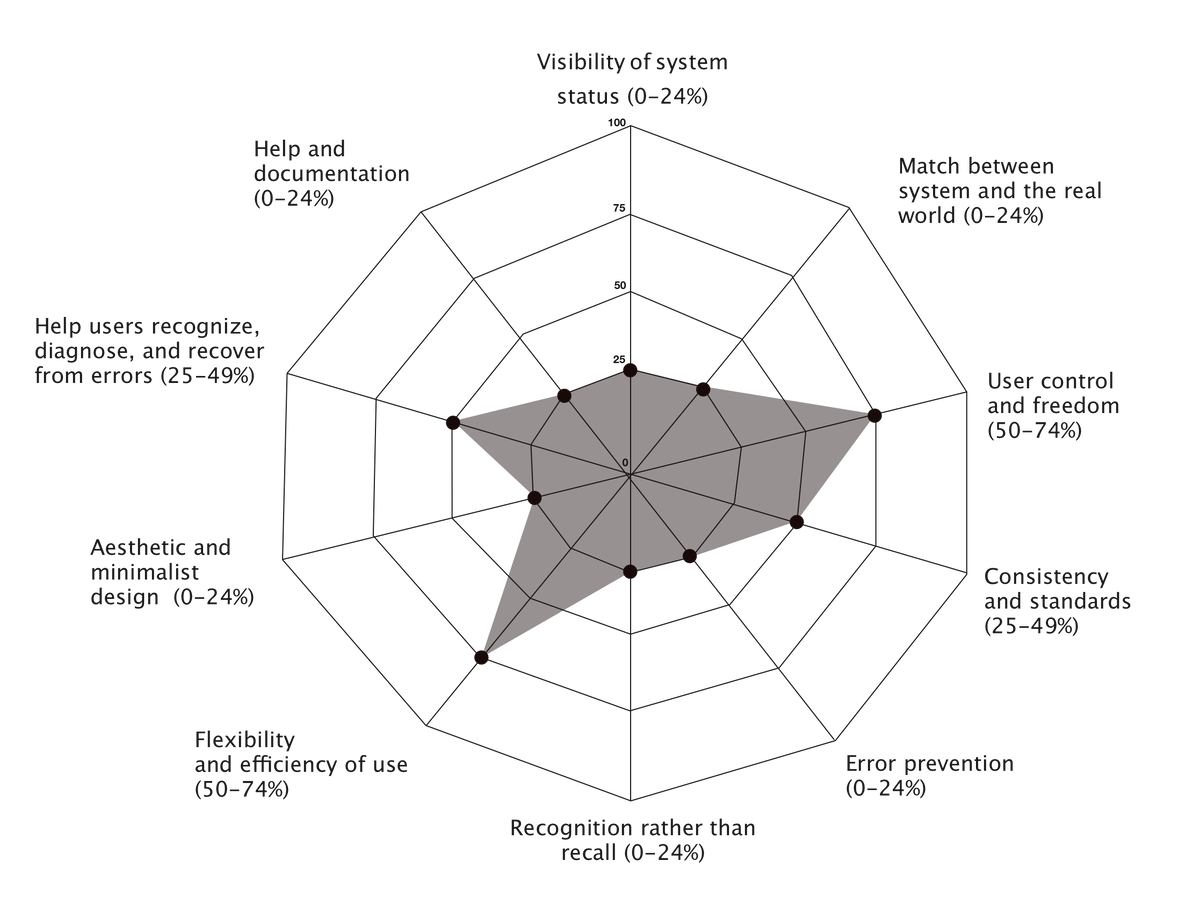
A heuristic evaluation is a method for finding usability problems in a user interface design. They involve having a small set of evaluators examine the interface and judge its compliance with recognized usability principles (the "heuristics"). Nielsen & Molich, 1990; Nielsen, 1994.The 10 Usability Heuristics for User Interface Design by The Nielsen Norman Group was used as the 10 defining evaluation criteria.
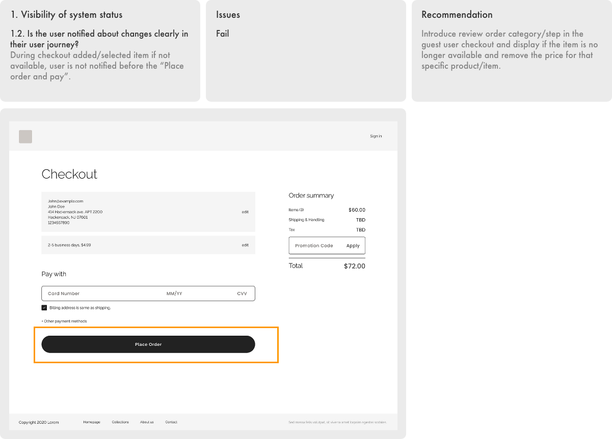
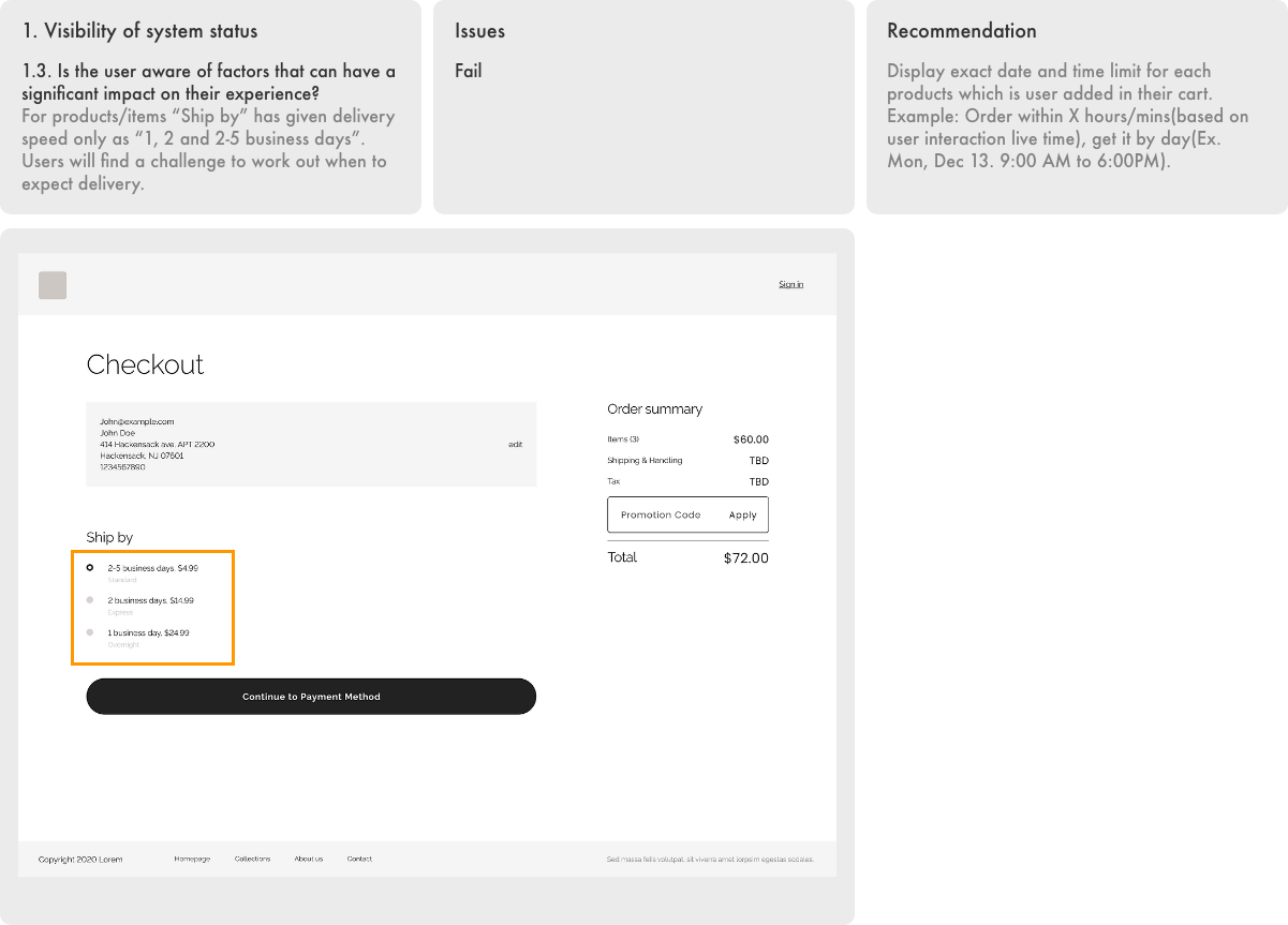
Visibility of system status
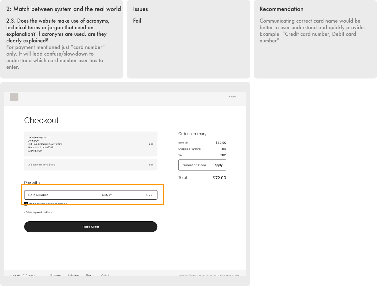
The system should always keep users informed about what is going on, through appropriate feedback within reasonable time.Match between system and the real world
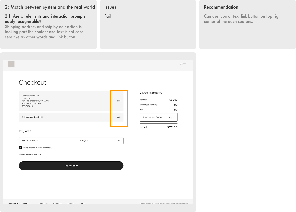
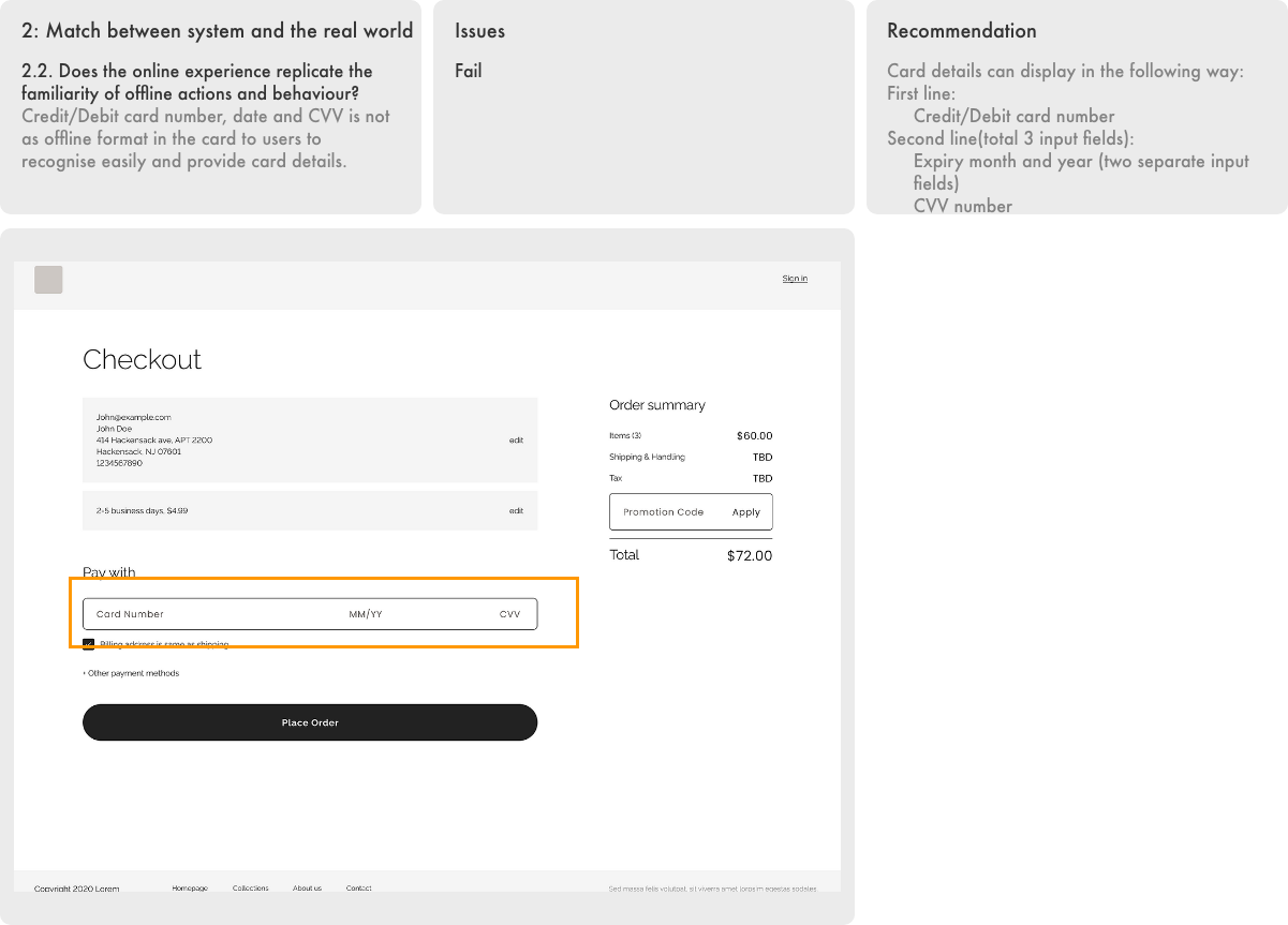
The system should speak the users’ language, with words, phrases and concepts familiar to the user, rather than system-oriented terms. Follow real-world conventions, making information appear in a natural and logical order.User control and freedom
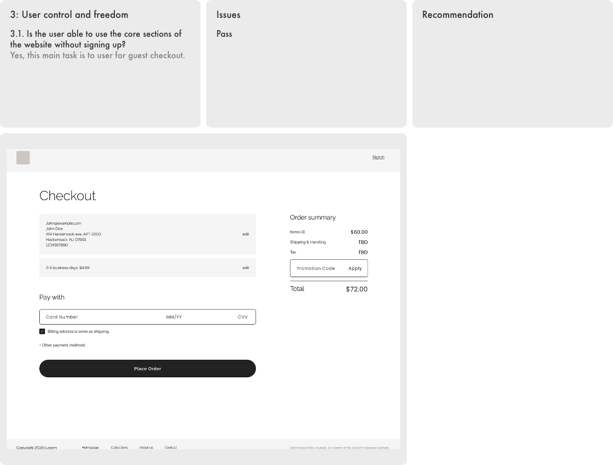
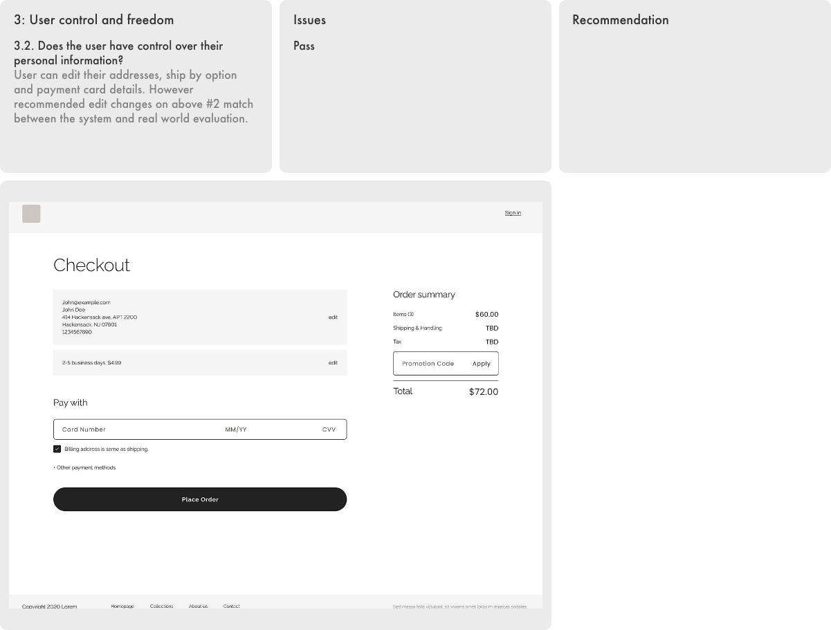
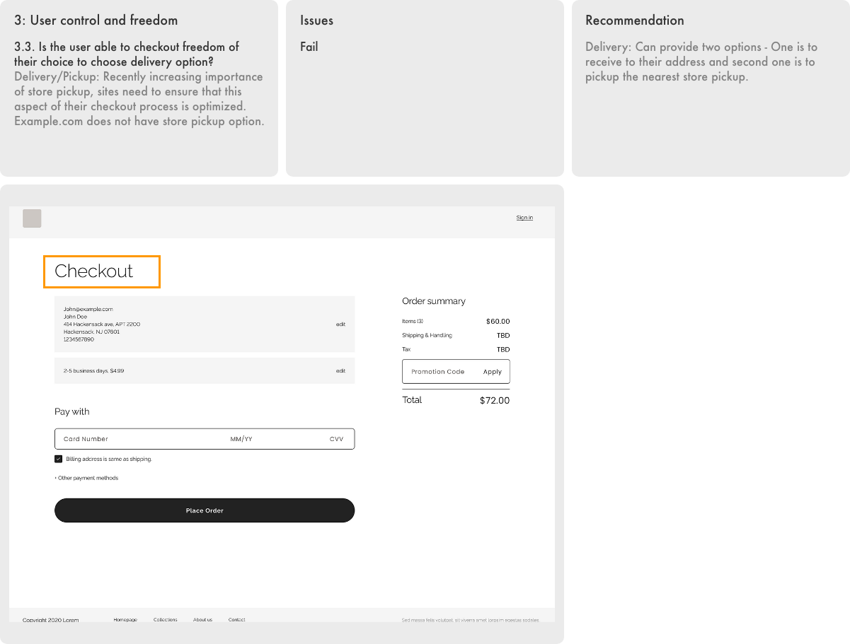
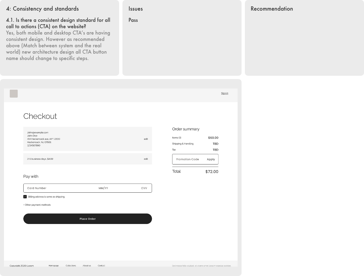
Users often choose system functions by mistake and will need a clearly marked “emergency exit” to leave the unwanted state without having to go through an extended dialogue. Support undo and redo.Consistency and standards
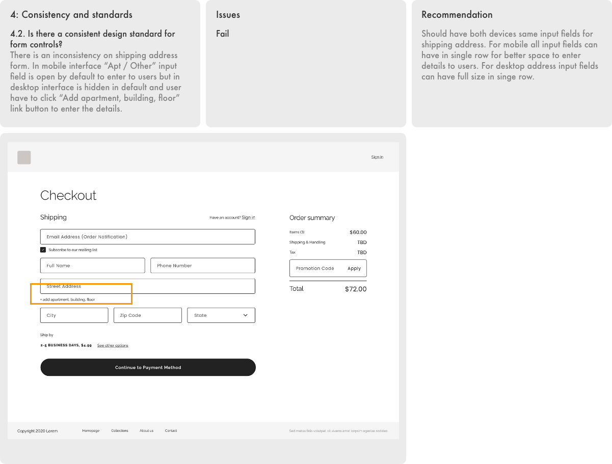
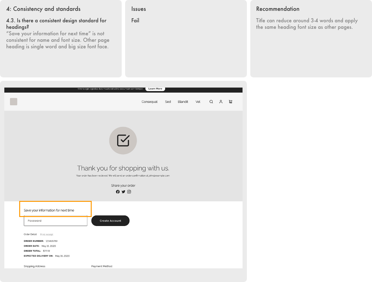
Users should not have to wonder whether different words, situations, or actions mean the same thing.Error prevention
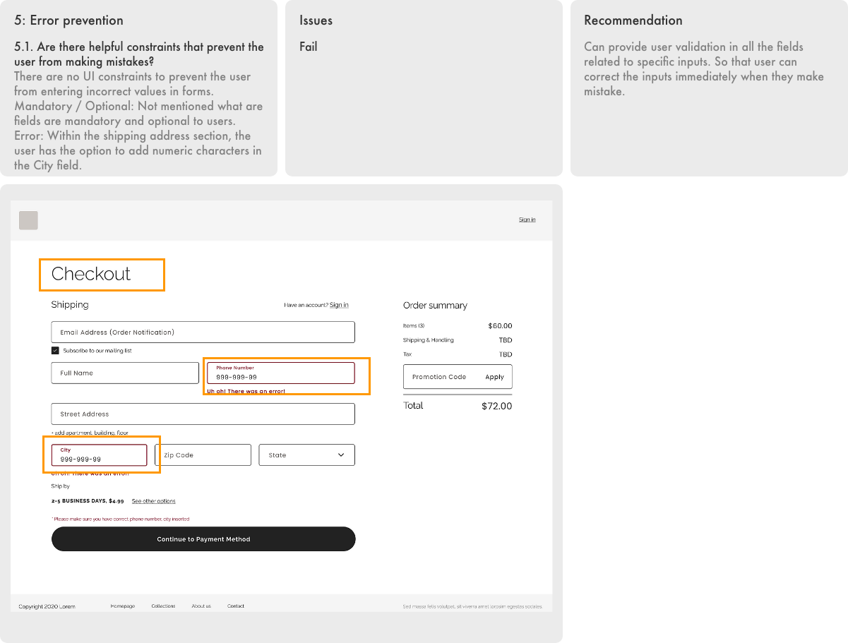
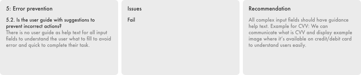
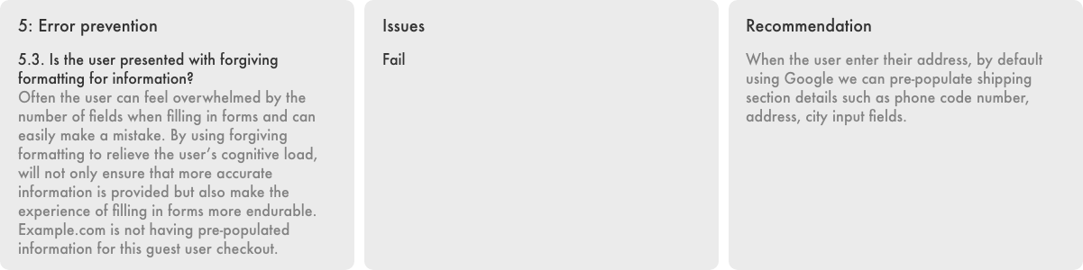
Even better than good error messages is a careful design which prevents a problem from occurring in the first place. Either eliminate error-prone conditions or check for them and present users with a confirmation option before they commit to the action.Recognition rather than recall
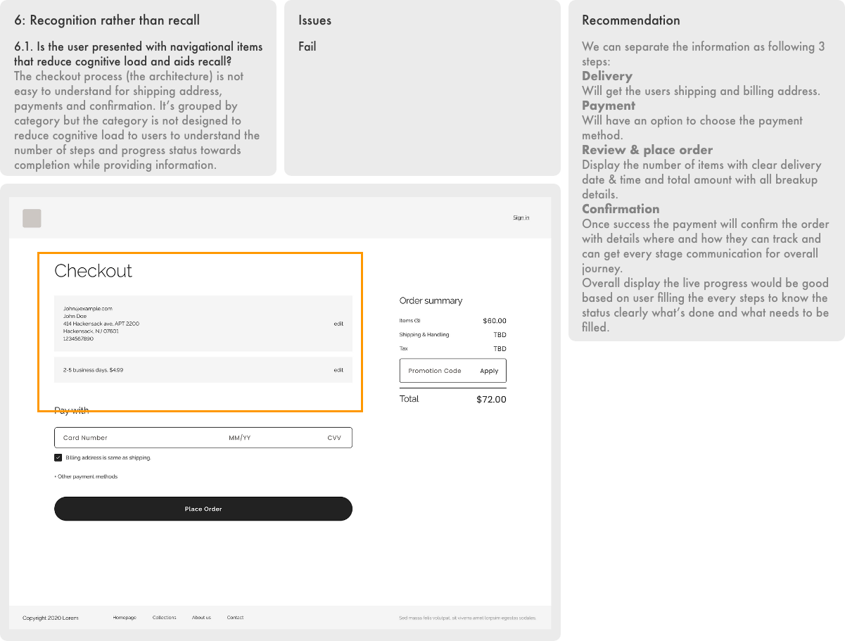
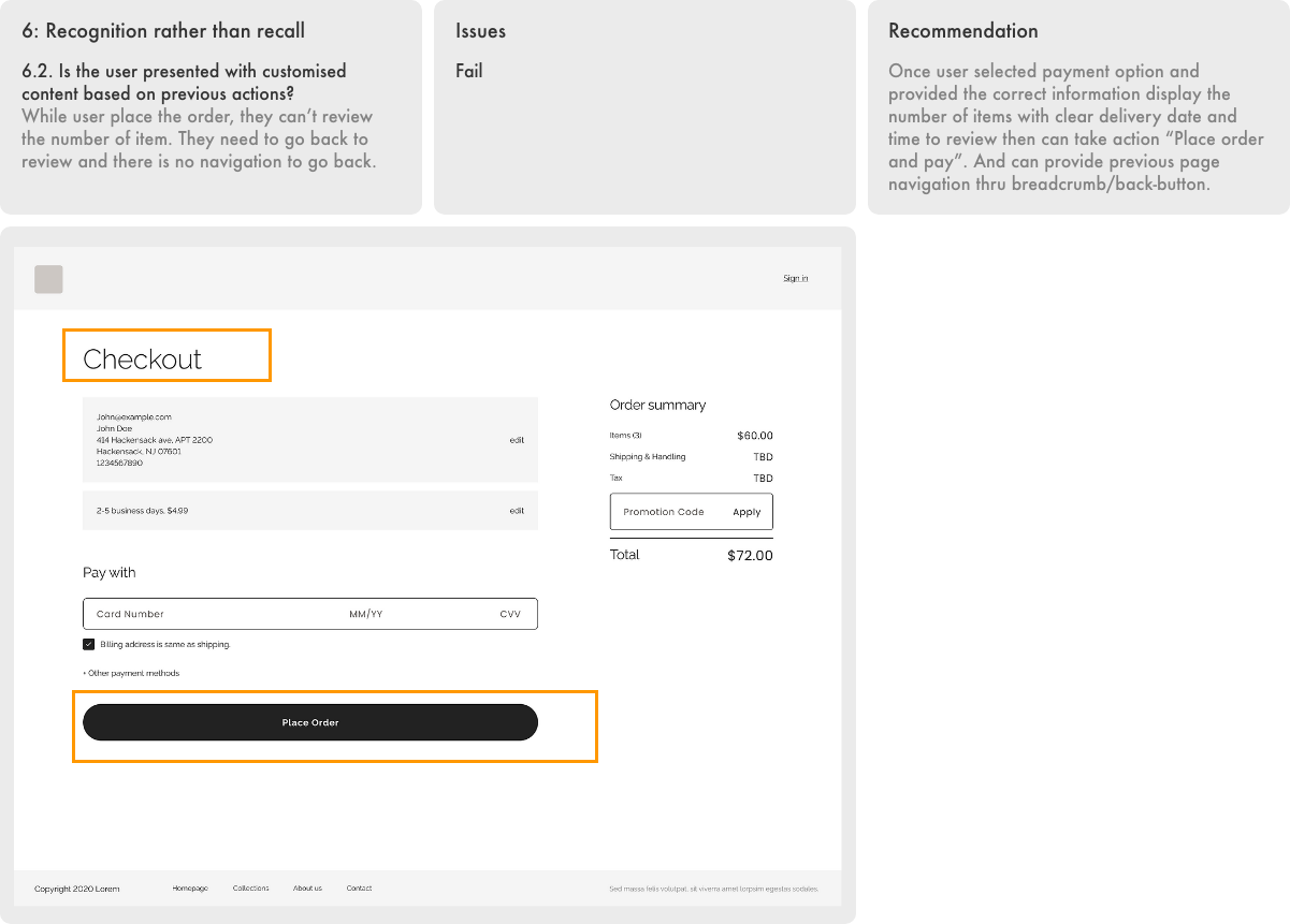
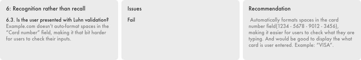
Minimize the user’s memory load by making objects, actions, and options visible. The user should not have to remember information from one part of the dialogue to another. Instructions for use of the system should be visible or easily retrievable whenever appropriate.Flexibility and efficiency of use
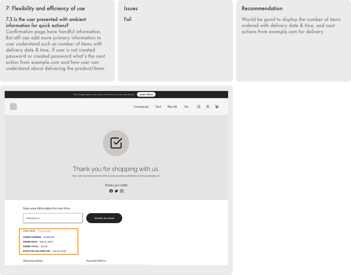
Accelerators — unseen by the novice user — may often speed up the interaction for the expert user such that the system can cater to both inexperienced and experienced users. Allow users to tailor frequent actions.Aesthetic and minimalist design
Dialogues should not contain information which is irrelevant or rarely needed. Every extra unit of information in a dialogue competes with the relevant units of information and diminishes their relative visibility.Help users recognize, diagnose, and recover from errors
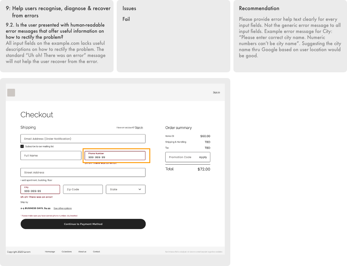
Error messages should be expressed in plain language (no codes), precisely indicate the problem, and constructively suggest a solution.Help and documentation
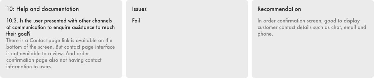
Even though it is better if the system can be used without documentation, it may be necessary to provide help and documentation. Any such information should be easy to search, focused on the user’s task, list concrete steps to be carried out, and not be too large.
Severity Criteria
A set of maximum 5 severity criteriaMore than 5 severity criteria can overcomplicate the outcomes and not present as useful, while less than 3 severity criteria will not allow for clear differentiation between the severity states.
Metric System for Evaluation
Severity ratings can be used to allocate the most resources to fix the most serious problems and can also provide a rough estimate of the need for additional usability efforts. These ratings are are a combination of frequency, impact and persistent of the problem. Each heuristic evaluation criteria is scored from the medium of the score per relevant screen on a scale of 0 to 4 as defined in the table below.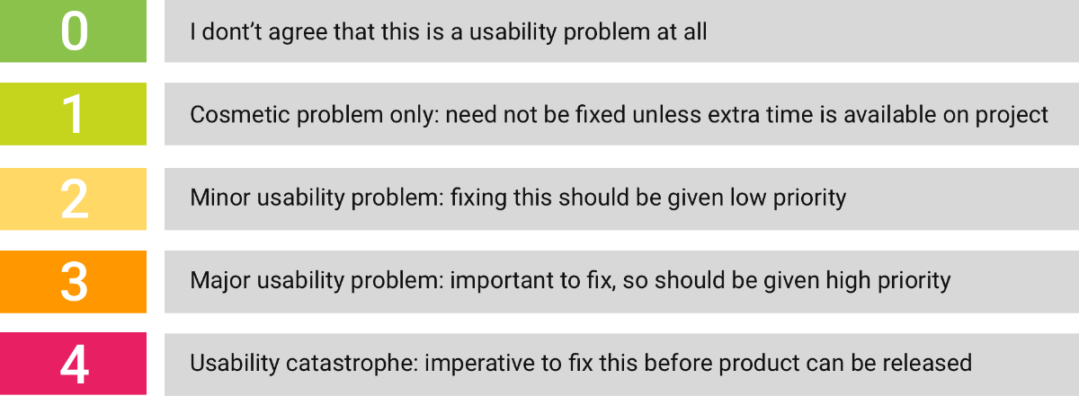
Task Analysis & User Goal
- Task
- Provide shipping and billing address
- Choose shipping option
- Payment
- Order confirmation
User Goal
- Make successful checkout easily
Evaluation Metric system
I used a tailored template evaluation sheet for each heuristic rule, measured the severity of each principal and provided the issues and recommendations. Then, based on the recommended point, I redesigned the screens using the app’s UI library.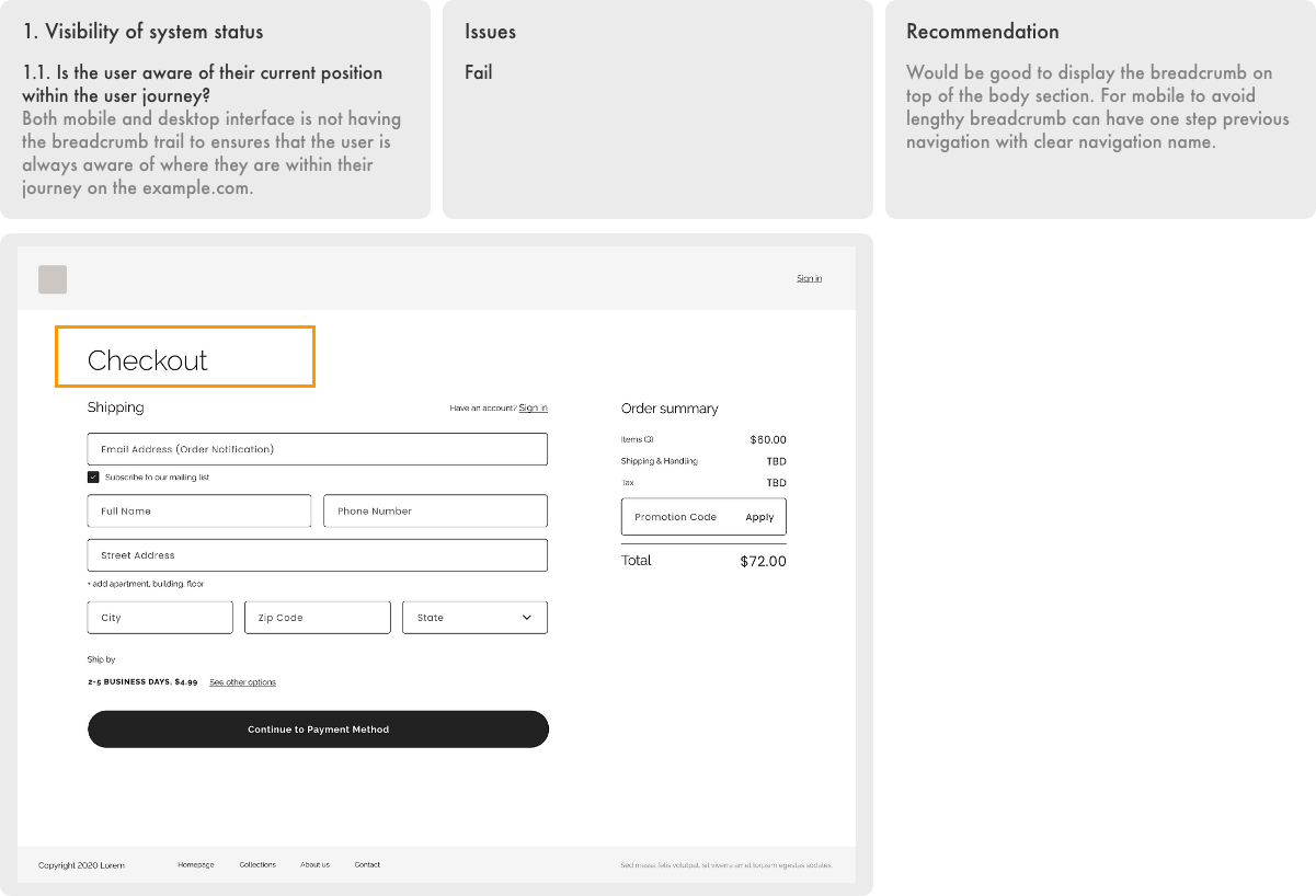


8: Aesthetic and minimalist design
8.1. Is the user interface design simple and easy to understand?
8.2. Is the user clear on what all the icons mean and why they’re included in the design?
8.3. Are all forms easy to understand and effortless to fill in?
No to all the above three questions. Have already mentioned above evaluation.
Please refer #1 to #7 criteria. Overall example.com guest user check need to improve for aesthetic and minimalist design.


Report
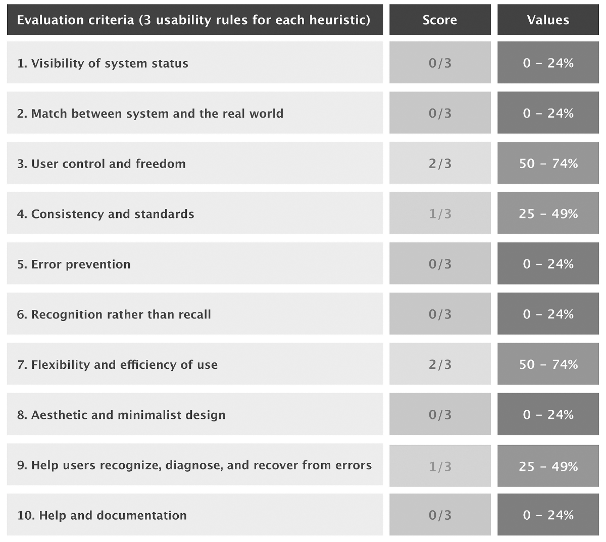
Radar chart report view