Overview
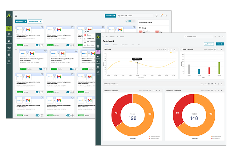
Adeptia is an AI-powered self-service data integration software platform used by organizations to integrate, automate, and manage their data and business processes.Our redesign of this platform needs to empower, encourage, and engage our users to complete and monitor their complex integrations.
Roles & Responsibility

Problems
The existing interface contained confusing & complex organization, inconsistent visual elements, and challenging operating model.Even though Adeptia is a self-service product, users became frustrated with requiring hands-on technical support and guidance while on the platform.
Goals
As the UX Consultant, my role was instrumental in unraveling the complexities and challenges embedded in Adeptia's product design, user journey, information architecture, and operating model.- Improved user flow
- Organized Information Architecture
- Users complete tasks independently
- Powerful Search & Conversational interface
Strategy

Adeptia Connect invites a variety of users Business Owners, Technical Experts to many users who contribute in achieving the end-to-end goal. But the user interface does not differentiate the users and does not provide them specific ‘things’ that they need most features, content and guidance. All the users are exposed to the same complexities.
Each of these users also go through a life-cycle they on-board, learn, and achieve maturity while building and managing integrations. Adeptia’s application does not cater to those at the early stages, which makes the learning tough and delays the adoption.
Design
Collaboration.

Easy Learning.

Discoverability.

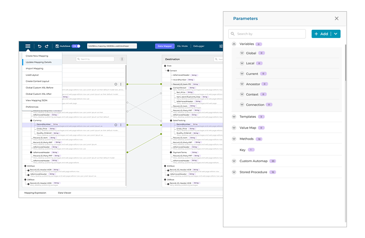
Within this Data Mapper, we give the perception of easy, fun, light-weight application although it is powerful enough to do complex things vs. seeming like a heavy-duty app.
Conclusion
In navigating the complex subject matter of automations, I championed clarity without sacrificing technical depth.User satisfaction and engagement increased significantly, onboarding times reduced, and overall task efficiency improved.

